Riff - Music Entrepreneur
INDUSTRY DESIGN PROJECT + UI/UX DESIGN
Turning Music Into A Sustainable Career
Role & Responsibilities
User Research: User Interviews, Persona Creation, JTBD Analysis, Red Routes
UX Design: User Flows, Site Map, Wireframing, Prototyping
Feature: “Superfan Builder”
Project Context
May - June 2023
Team-based UI/UX Project
Team: Harrison Lee (Product Manager), Demi Oyebanji (Content Lead), Jonas Nocom (UX Designer), Bora Kim (UX Designer), Jing Zhou (UX Designer)
Tools Used
Figma
Slack
Google Drive
A startup "Riff" provides a web application called "Music Entrepreneur," designed to serve as artists' personalized business coach, aiding them in establishing the groundwork for a sustainable career.
This application collects and analyzes users’ career data, subsequently assisting them in comprehending, strategizing, and monitoring their professional growth.
The application offers three key features: Project Timeline, Superfan Builder, and Electronic Business Kit. I was tasked with leading the design direction for the Superfan Builder feature on the mobile browser, aimed at helping artists expand their fanbase.
Problem
Riff offered only a desktop version of Music Entrepreneur, which limited accessibility for artists using the product. Furthermore, significant improvements were needed in the UX/UI design of the Superfan Builder feature, preventing artists from fully leveraging their potential to reach and grow their fanbase.
Solution
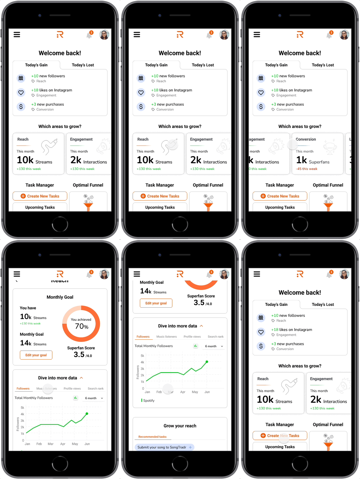
Monitor fanbase data changes
Track the daily growth or decline of your fanbase
Explore deeper insights into Reach, Engagement, Conversion, and Loyalty data
Establish and modify monthly goals, then monitor your progress toward achieving them
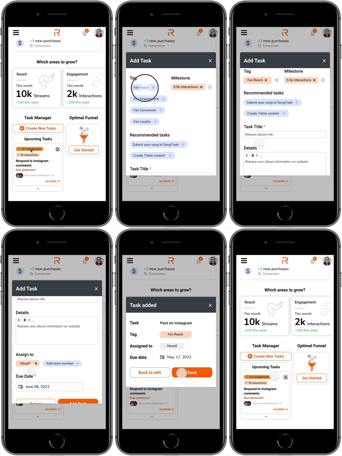
Fanbase expansion strategies
Identify and enhance specific areas where you may have lost fans in a day
Tailor your actions based on factors such as reach, engagement, conversion, or loyalty
Customize your approach to align with your specific goals
Our approach
Week01
Kickoff Session
Project Brief
Create an intuitive platform for artists to effortlessly gather and analyze their career data, empowering them to gain insights, strategize, and monitor their artistic journey. Within the "Superfan Builder (SB)" feature, artists should have quick access to real-time updates in their data, the ability to delve into specific data points, and the capability to set actionable tasks aimed at boosting their fan metrics.
Needs
Introduction Page
“Welcome Widget” section
Show updates of what happened in the artists' data
“Immediate Impact” section
Recommend tasks that are relevant to certain data outcomes like a loss in artists’ data
Task Management
4 areas in the artists’ data
Reach/ Engagement/ Conversion/ Loyalty
Given
We received desktop web app screens, ME prototypes, user testing videos, and a style guide, which served as valuable assets to make our design consistent
Organization and Communication
To enhance teamwork, it was essential to establish a virtual whiteboard, co-owned repository, messaging platform, video conferencing solution, and cloud-based file storage system.
Whiteboarding and Repository
Figma
Our team opted for Figma as our collaborative platform for UI/UX design activities. We consistently utilized shared design files to facilitate collaboration among team members whenever we worked on design deliverables.
Messaging & Video Conferencing
Slack & Zoom
We employed Slack as our primary messaging system to seamlessly share design files and project deliverables with both our stakeholders and team members, fostering discussions and monitoring project progress. Additionally, we chose Zoom as our video conferencing software due to its capability to record crucial sessions, including stakeholder meetings and usability tests.
Cloud-Based Filing System
Google Drive
Google Drive served as our preferred cloud-based file storage system, offering us the flexibility to store and access a wide range of files, including design deliverables, research recordings, and resources shared by Riff. Additionally, we facilitated stakeholder access to specific files by sharing them through this platform.
Secondary Research Synthesis
To assess the current issues with the 'SB' feature, I analyzed previously conducted user interviews with Riff's customers. These interviews included a series of questions about their experiences with fan growth using the product.
Following this research, I synthesized the problems found within the "SB" feature, and the key findings are outlined below.
Persona
We developed a user persona, a tool to constantly remind us of our target audience during product design. This approach helped us gain insight into our users' characteristics, enabling us to effectively address the challenges they might encounter.
Jobs To Be Done & How Might We…
Purpose
The Jobs-To-Be-Done (JTBD) framework was instrumental in identifying the precise circumstances, motivations, and expected outcomes for users interacting with the SB feature. Utilizing insights from the JTBD analysis, we formulated 'How Might We' (HMW) questions. These questions guided us to pinpoint the critical 'red routes' for our subsequent steps.
Findings
My analysis revealed that data comprehension and task creation are key activities users frequently engage in. This insight became the foundation for my focus on developing a seamless flow for tracking fan data and creating tasks. Consequently, I identified these elements as the core components of the Minimum Viable Product (MVP) for the SB feature.
Red Routes
Purpose
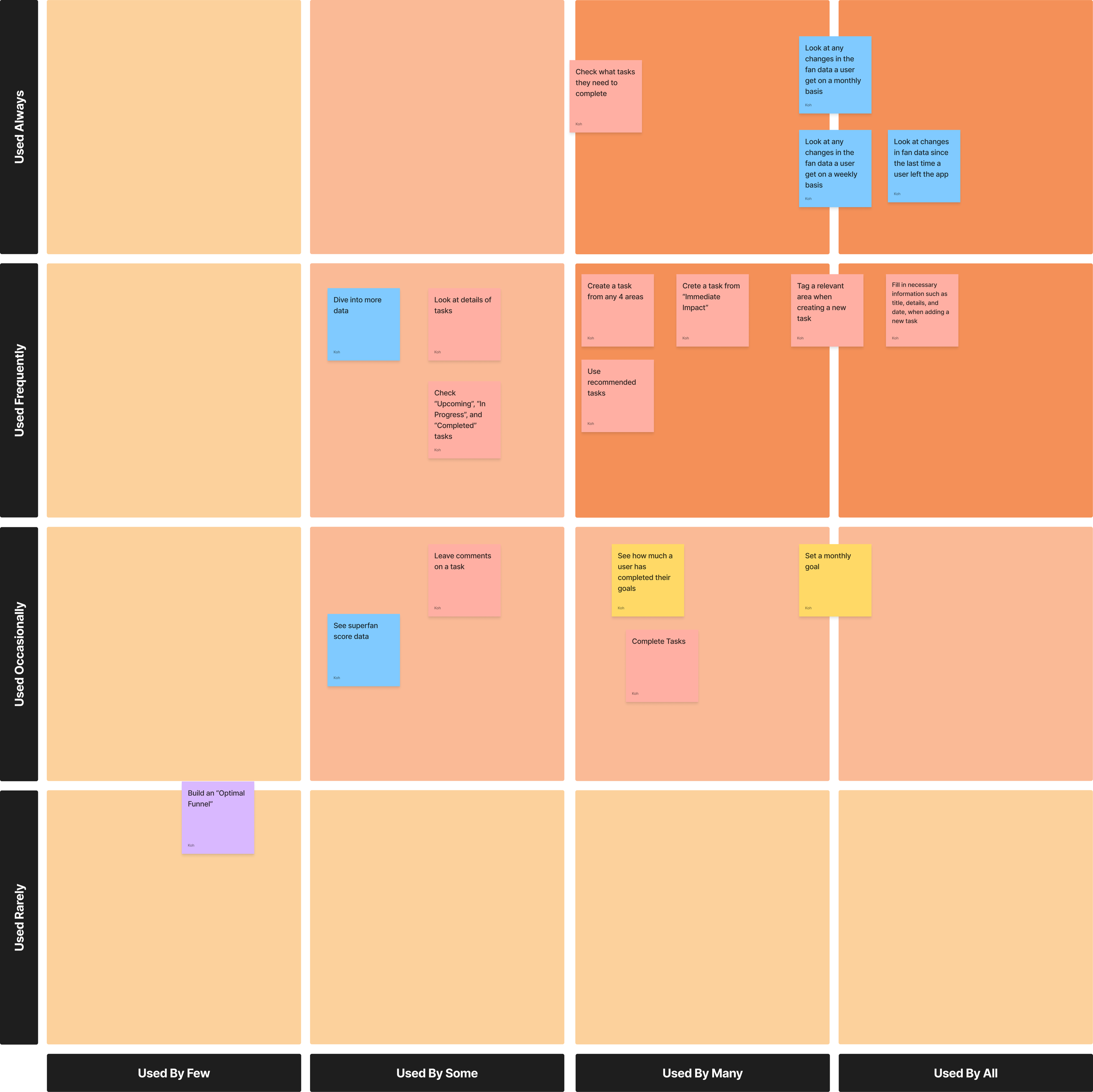
The Red Routes were crucial for identifying key tasks that maximize user value and improve their app experience. I identified these critical paths by categorizing user activities using a matrix that considered both usage frequency and user volume.
Findings
I uncovered that the essential feature sets for the SB include:
Generating tasks for areas users wish to develop.
Monitoring any alterations in users' fan data.
Week02
User Flows
Purpose
Crafting user flows enabled me to identify critical decision points in the task creation process and understand user interactions with their fan data. These flows also played a vital role in shaping the design of wireframe screens.
Findings
Having previously pinpointed the red routes, I delved deeper into the user flows associated with monitoring changes in fan data and creating tasks.
The tracking changes flow: It becomes essential to present easily digestible information that guides users effectively through two primary sub-flows – viewing data across all 4 areas and swiftly accessing critical data.
The task creation flow: It's beneficial to offer a streamlined approach to task creation across three key sub-flows – selecting any of the 4 growth areas, promptly accessing important data, and utilizing the "Task Manager" section.
Site Map
Purpose
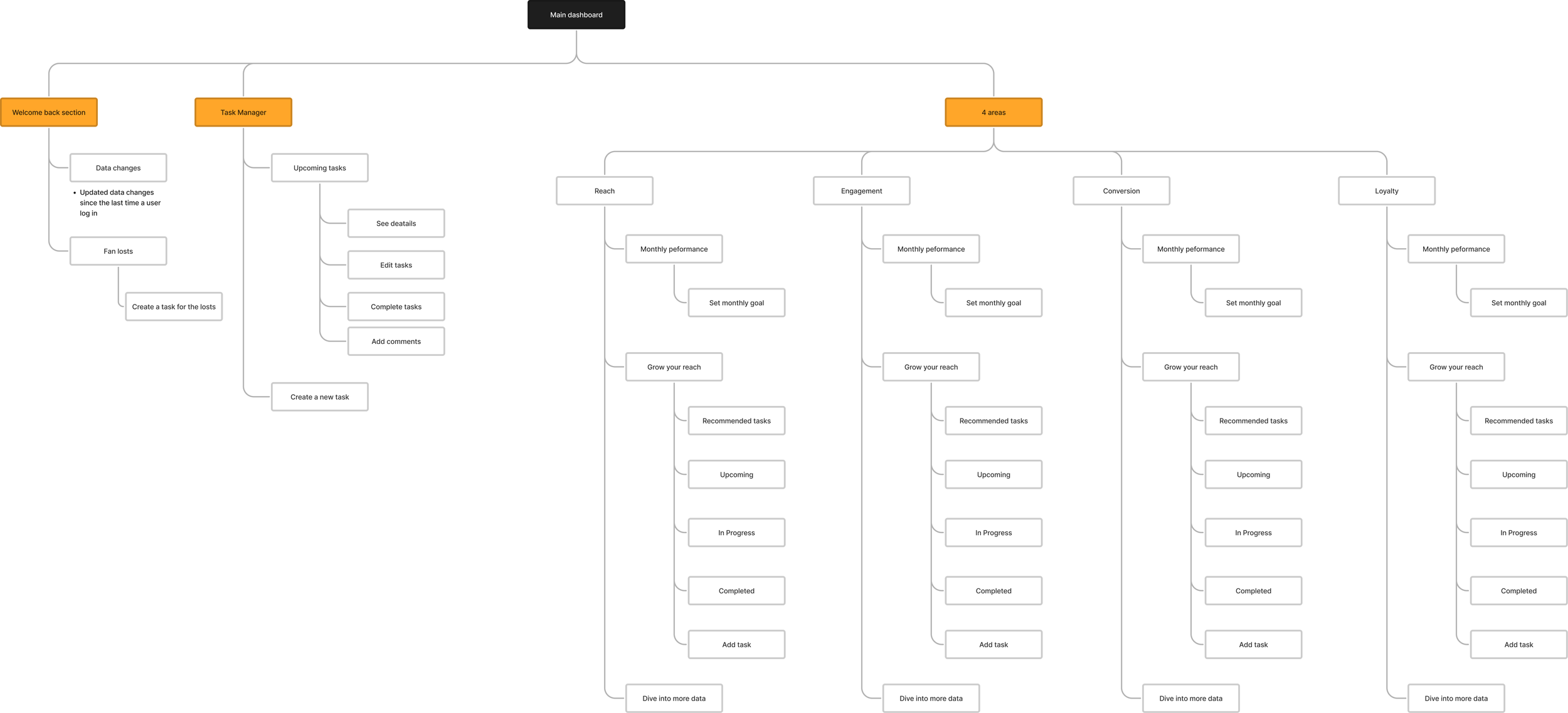
I created the site map to clarify information architecture and navigation, serving as a starting point for identifying the necessary features on each screen. Some users had difficulty finding sections and buttons due to the complex information architecture, making it essential to streamline navigation.
Week03
Wireframing Process
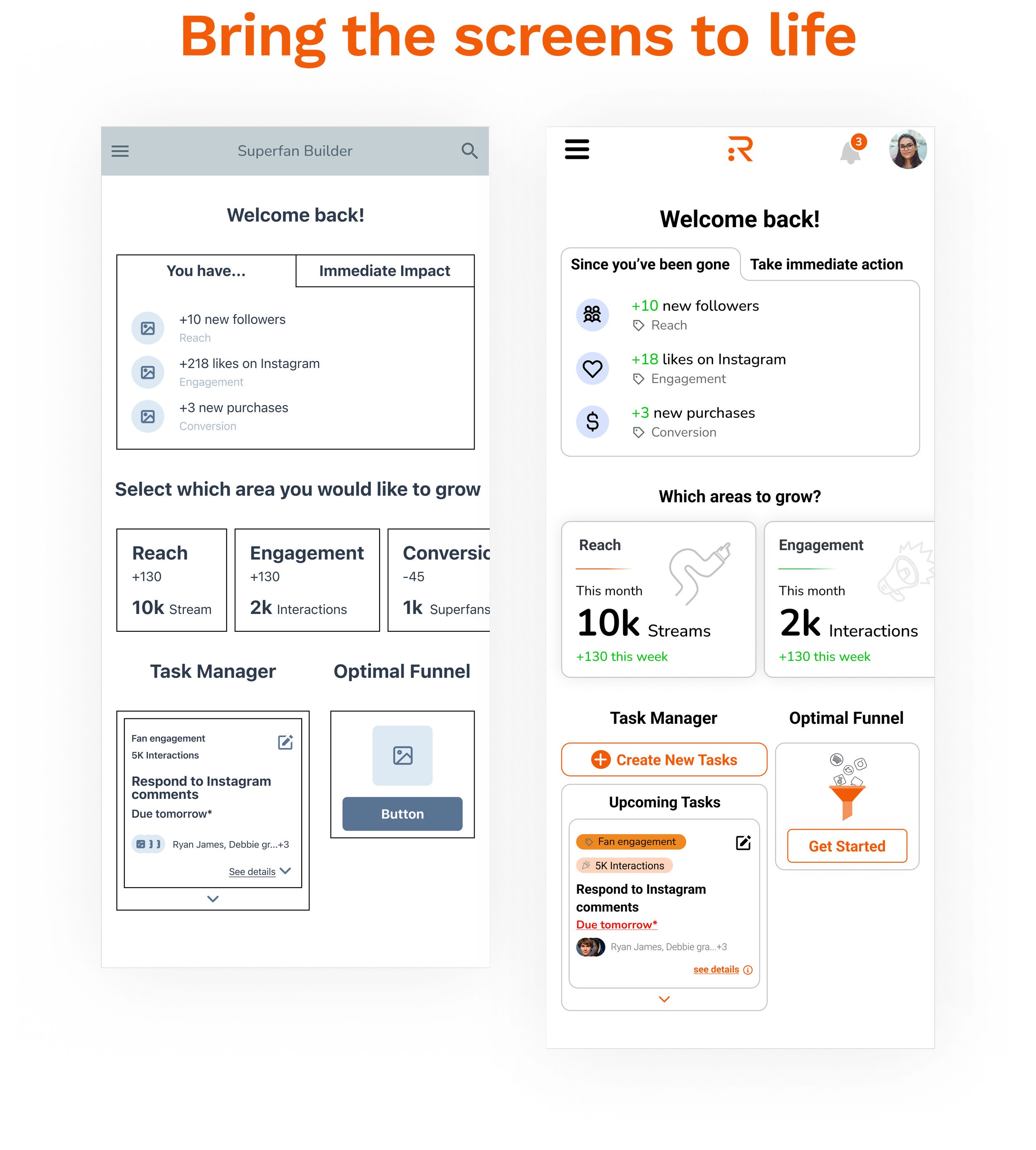
Our team utilized Figma to create a collaborative design file. Within this shared space, team members could individually design wireframes for their assigned tasks, review each other's work, and provide valuable feedback. For my specific role, I focused on designing wireframes for two critical user pathways: creating tasks for areas of user growth interest and monitoring changes in users' fan data."
Week04
Design System
Riff had a design system for the desktop version of the application. Our team then extended this system to create a mobile version, ensuring high-fidelity screens remained consistent across different features.
I incorporated color to highlight shifts in their fanbase data, ensuring that important changes stand out.
I designed the menu bar to maintain a cohesive and uniform appearance throughout all the features, creating a seamless user interface.
I introduced illustrations to enhance understanding and engagement, making the information more visually appealing and accessible.
Iterative Design
Integrating a detailed section within a single dashboard may result in clutter, especially on a mobile device. It aligns better with information architecture and user behavior to have a separate page dedicated to the detailed section.
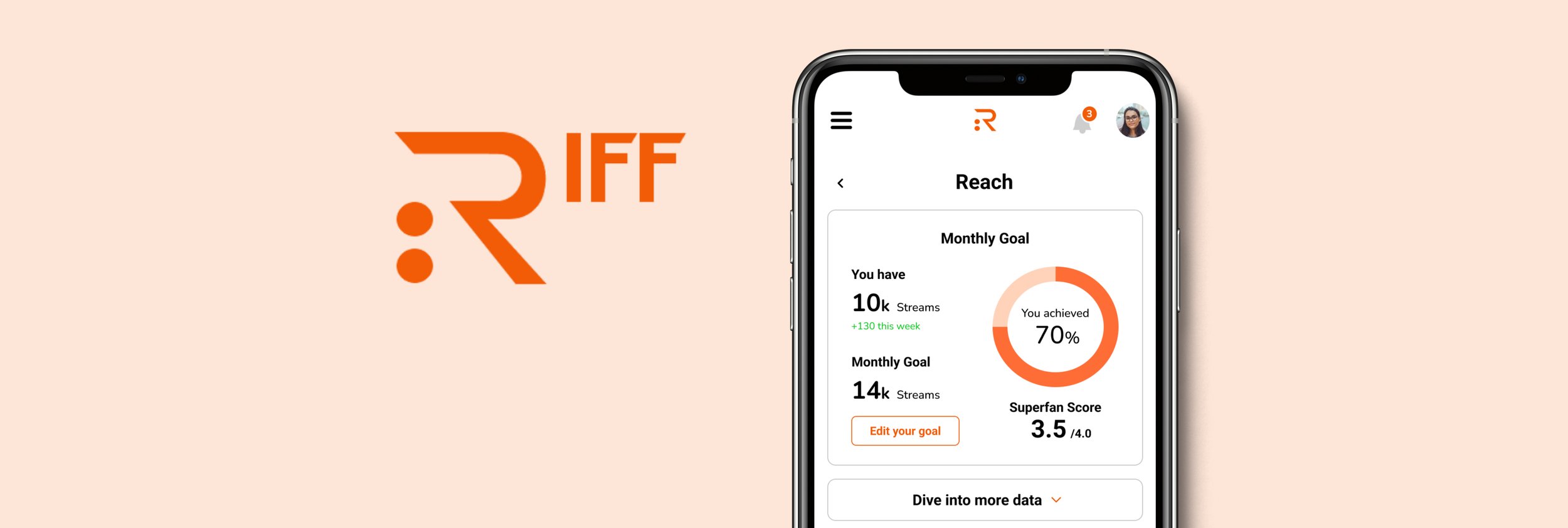
Enhanced clarity for the "Monthly Goal" figures was necessary as many users found them confusing. We addressed this by adding descriptions for each figure and restructured the elements in conjunction with user flows.
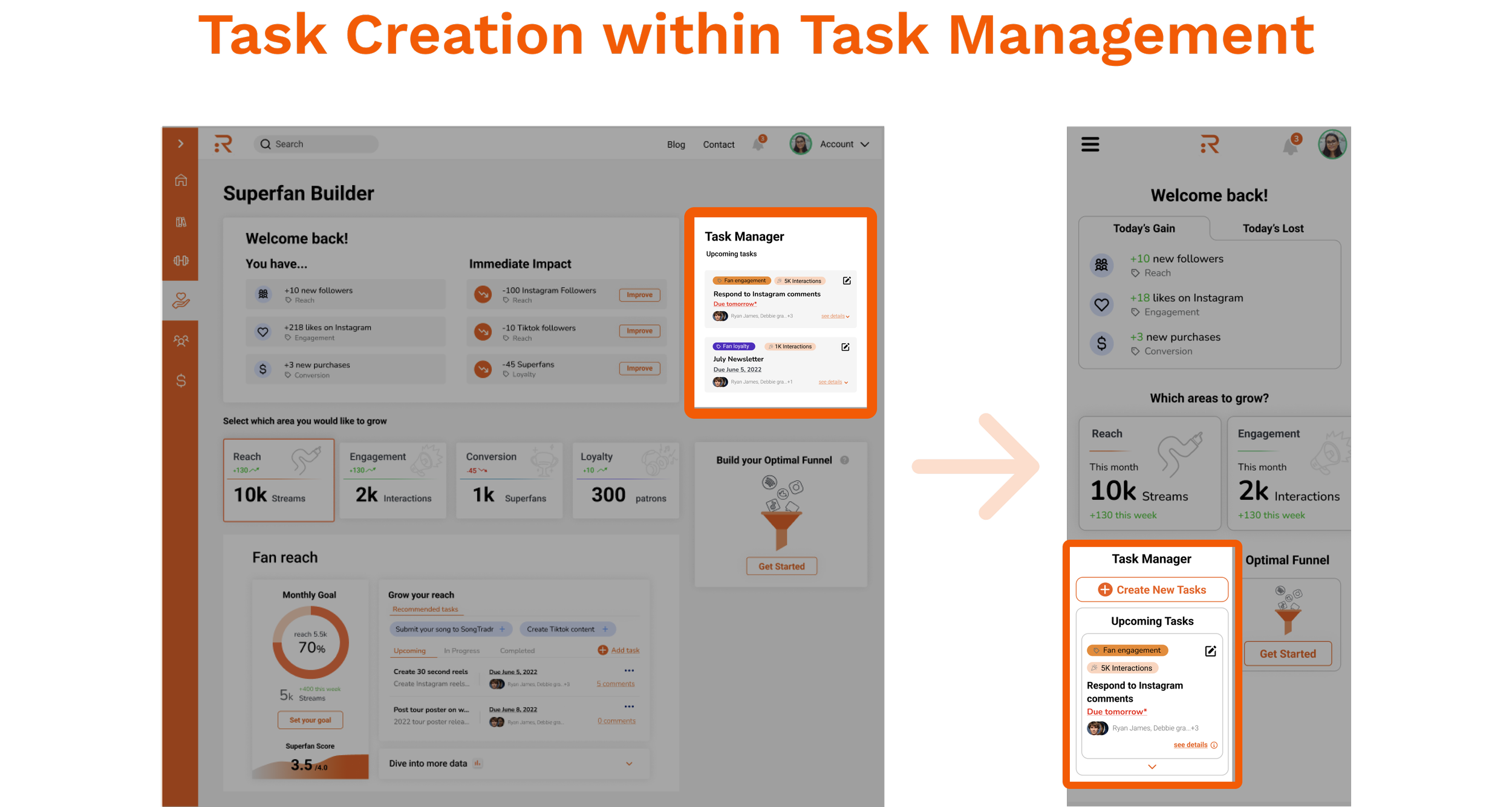
Initially, locating the buttons for creating new tasks posed a challenge due to their placement and design. Based on user behavior, it became evident that users most naturally expect to find the option to create a new task within the task management section.
The original main dashboard simultaneously displayed both sections, "Today's Gain" and "Today's Lost," which proved impractical for mobile screens. In the revised design, users were given the ability to switch between these two sections, enhancing mobile usability.
Week05
Usability Testing
For the usability testing, we enlisted a few artists, actual customers of Riff, and guided them through our three main features: Project Timeline, Superfan Builder, and Electronic Business Kit. Specifically, in the Superfan Builder, I asked one of the participants to perform five tasks related to the two primary user flows—tracking fan data and creating tasks.
Here are the tasks for the participant:
Please describe what you see on the dashboard screen.
How would you go about creating a task if you've recently lost fans in a specific area?
If you'd like to enhance a particular aspect from the four main sections (reach, engagement, conversion, and loyalty), how would you create a task for it?
Can you explain what you see on the detailed page for one of the four main sections?
Lastly, how would you create any tasks you want to work on?
Findings
The participant was able to successfully complete all of the tasks independently. However, one point of confusion arose concerning the functionality of the "Optimal Funnel" feature. This feature is designed to consolidate various social media platforms used for music business, allowing users to track changes in fan data across these platforms within a single interface. Currently, the app lacks both the functionality and explanation for this feature, indicating a need for future iterations to enhance its usability and clarity.
Conclusion
Future Plans
In our upcoming initiatives, we aim to introduce a new feature called the "Optimal Funnel." This feature will empower users to consolidate all their social media accounts onto a single platform, providing them with a centralized hub. Here, they can seamlessly monitor changes in their fan data and craft effective strategies to enhance their performance on each distinct social media platform.
Additionally, as part of the future roadmap, Riff may explore the incorporation of a "Monthly Goal Setting" feature. This functionality will enable users to establish specific monthly objectives and closely track their progress towards achieving these goals. To bring this feature to fruition, we will undertake the creation of user flows and design screens that vividly depict the progression of these workflows.
Learnings
This project was a first-time experience for me in terms of collaborating with fellow designers, and it provided me with a wealth of valuable insights. I gained a better understanding of effective team communication, especially since each team member was located in different parts of the United States. To ensure seamless and efficient remote collaboration, we relied on a variety of communication tools such as Slack, Zoom, and Doodle, which allowed us to work together effectively and meet project deadlines.
Another significant lesson I took away from this project was the importance of staying aligned with our stakeholders. When I had design ideas for the product, I consistently made an effort to explain the rationale behind those ideas to the stakeholders. This open and transparent communication allowed for constructive feedback, which in turn guided iterative improvements to my work. This approach ensured that my design efforts remained closely aligned with the Riff's overall objectives and requirements throughout the project


