ORIGIN - Web Portal
FULL TIME + UX DESIGN + RESEARCH
Helping technical people manage wifi-sensing system and interpret Motion Classification data.
Origin AI provides advanced WiFi-sensing technology to enterprise customers across industries such as home security, Internet Service Providers, Health & Wellness, and IoT. Our technology utilizes WiFi signals, combined with a sophisticated AI engine, to detect and interpret physical movements and environmental changes within a space.
The company has a Wi-Fi sensing system management and data visualization software called "Web Portal." In this project, I worked on the Web Portal's "Intrusion Detection" feature, which detects property intrusion by classifying motion between human and non-human movement.
Role & Responsibilities
User Research: Focus Group, User Interviews, Affinity Mapping, Persona Creation, Journey Mapping
UX Design: Sketches, Wireframing, Prototyping
Project Context
March - November 2023
Industry Design Project
Team: Joseph Valencia (Chief Product Officer), Brendon Powell (Product Manager), Daniel Bugos (Product Manager), Lin Chen (Full-stack Developer)
Tools Used
Figma
Jira Software
Notion
Problem
The company's existing web portal faced usability issues, resulting in inefficiencies in testing the Intrusion Detection engine for external customers and internal users.
In response to this, our team aimed to enhance the System Usability Score (SUS), a metric we utilize to assess the perceived usability of our system quantitatively.
Solution
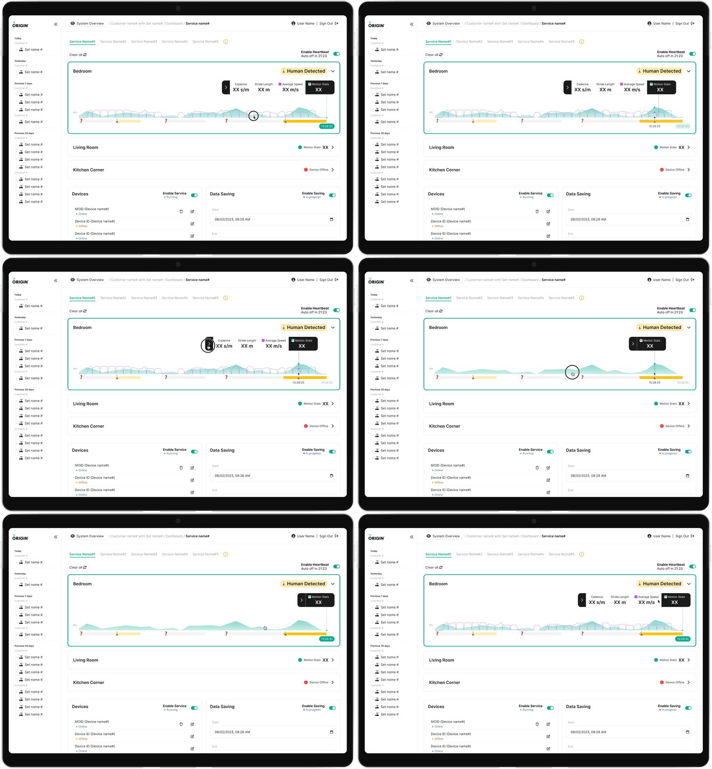
Real-time data gathering
Allows users to view multiple data types for motion detected at a specific time, simply by clicking on a tooltip
Enables users to identify the types of motion detected on a one-minute scale in real-time
Introduces a threshold line to help users easily understand the classification of detected motion
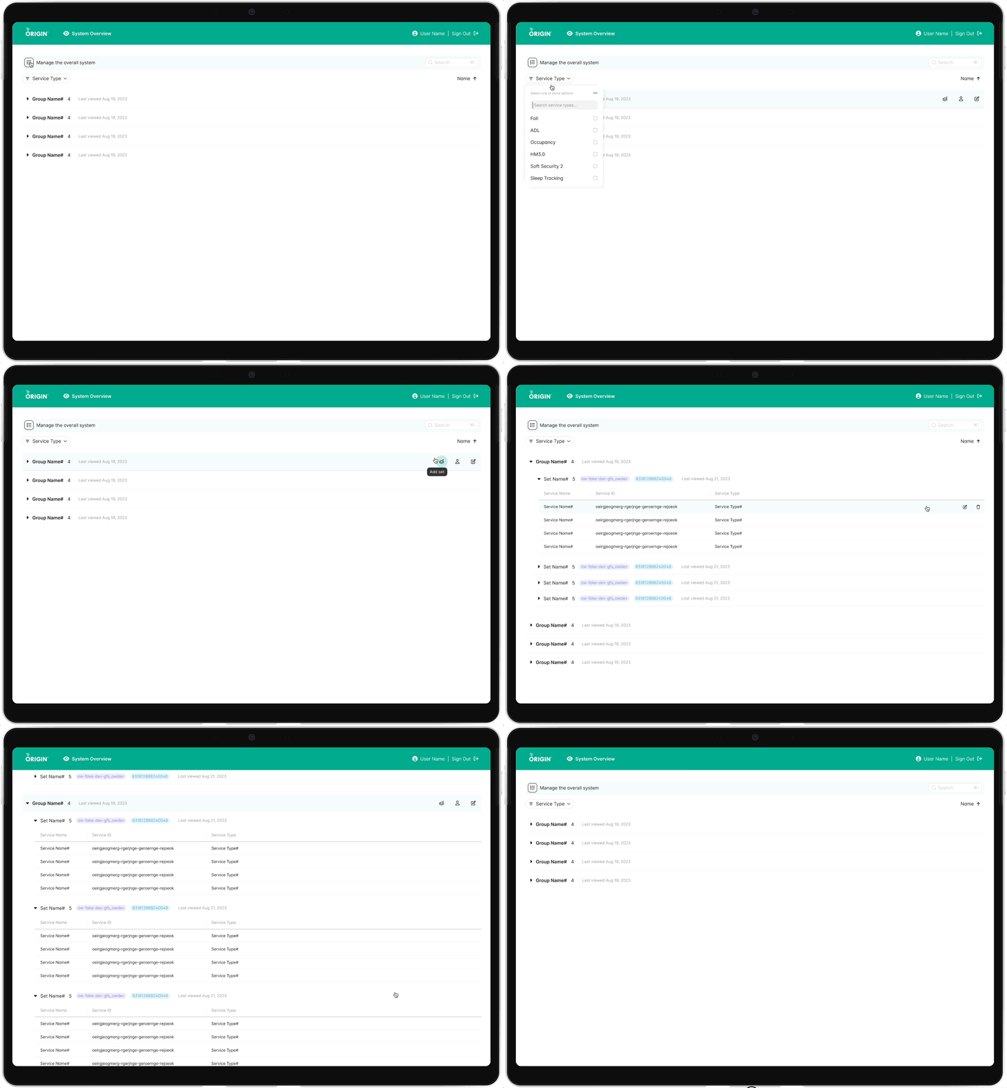
Efficient system oversight
Structures the information in a hierarchy: Group, then Set, followed by Service
Searches and filters lists by service types and other keywords
All action items are centralized in one location, with each item appearing on a separate row for every level in a table
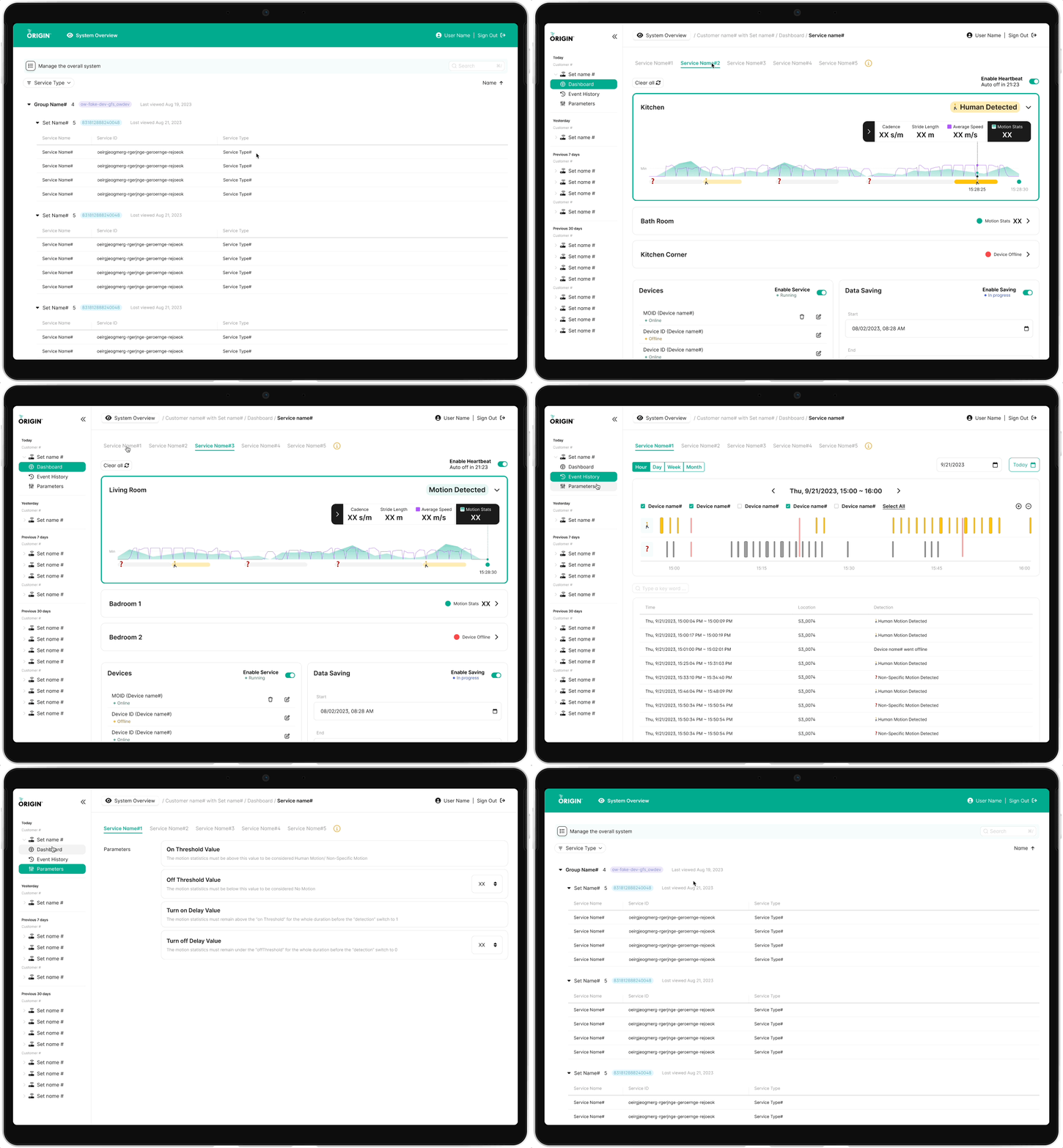
Seamless navigation experience
Sorts sets by recent access, displaying their group names in the side navigation bar
Enables users to switch between services within the same set using the tab feature
Adds a floating button to the breadcrumb navigation, enabling users to easily switch back and forth between the 'System Overview and 'Service View’
Our approach
We executed this project using the Scrum framework, dividing our weekly design sprints into three phases: 'Define' for setting goals, 'Research/Design' for developing, and 'Evaluate' for gathering feedback from stakeholders and assessing our progress.
Research
Our research was conducted in two distinct phases to gain a comprehensive understanding of the Intrusion Detection system.
In Phase 1, we delved into understanding the workings of the Intrusion Detection system. This involved acquainting ourselves thoroughly with the solutions currently available on the existing web portal. Our aim was to build a solid foundation of knowledge about the system's functionalities and its operational framework.
In Phase 2, we focused on user engagement. We conducted focus groups and user interviews to gather diverse insights. The data collected was synthesized into an affinity diagram, which facilitated the creation of user personas and journey maps, leading to the development of targeted design ideas for the Intrusion Detection system.
Understanding existing solutions
We conducted an analysis of the problem space to understand how the current web portal assists users in managing the system and interpreting motion classification data.
Hands-on engagement
We configured ESP32 DevKits and connected them to the web portal network to establish a Wi-Fi sensing environment. This setup enabled us to conduct physical tests on how motion is classified by the Intrusion Detection application engine.
Empathizing with users
Through user interviews and focus groups, we engaged in story-based conversations that revealed their pain points and needs. This approach provided us with detailed insights into the contexts surrounding these issues.
Analysis
We have consolidated the data gathered from the focus group and user interviews into an affinity map. This map serves as a valuable tool for extracting insights and facilitating brainstorming sessions to generate design ideas aimed at addressing various issues.
Insights
Using the affinity diagram, we derived the following insights by grouping together related information concerning the problem in the web portal.
Personas
Drawing from our insights and research findings, we developed two personas that encapsulated the core characteristics of our users, which helped us keep them at the center of the design process.
Journey maps
Drawing from our insights and research findings, we developed two personas that encapsulated the core characteristics of our users, which helped us keep them at the center of the design process.
Design
Based on our research insights, we pinpointed three primary user flows: real-time data collection, overall system management, and software navigation. Subsequently, we brainstormed design ideas for each of these flows.
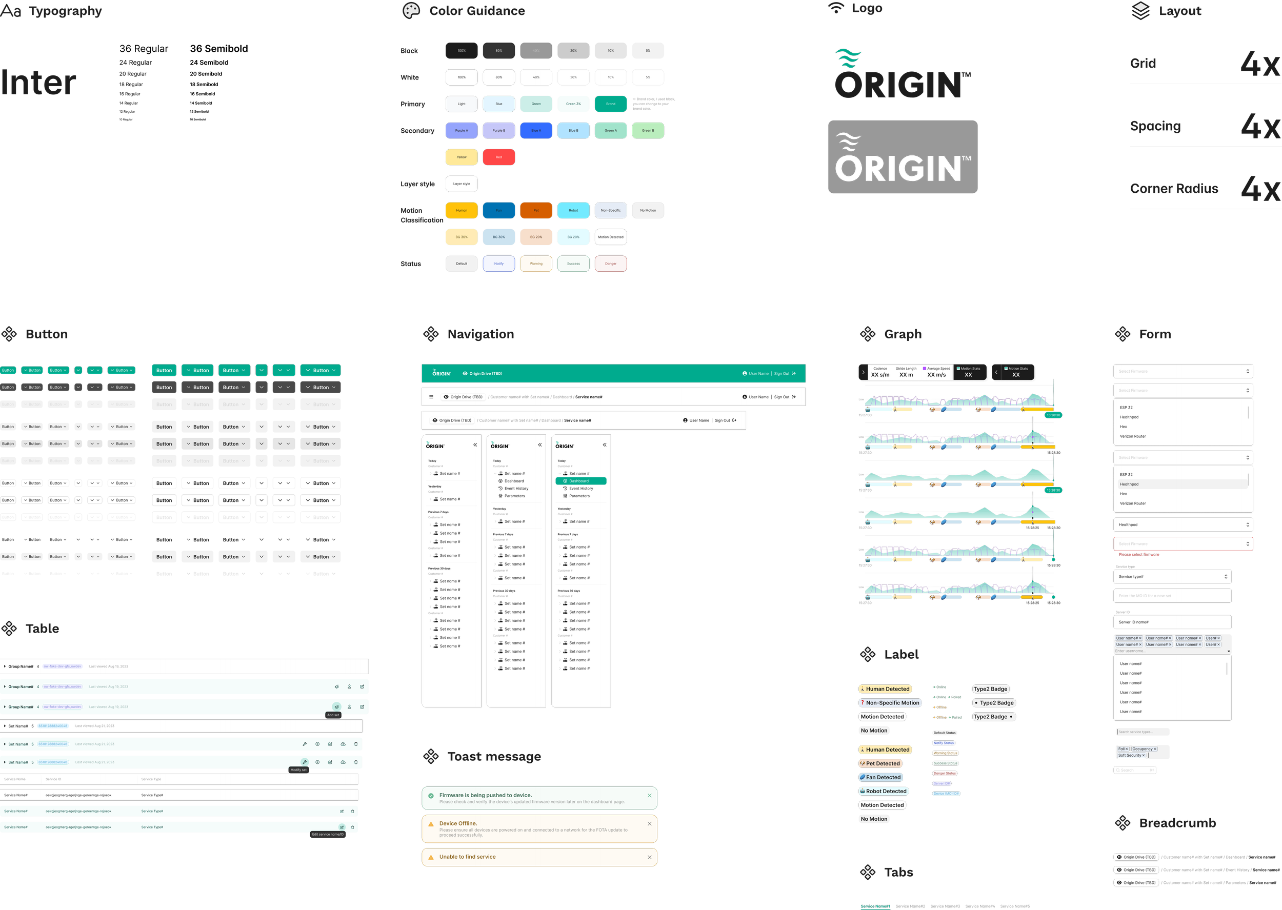
Design System
The Design System streamlined my project with consistent standards across screens, also speeding up front-end development. For the Intrusion Detection application, we focused on inclusive design, especially a color-blind-friendly color scheme, essential for representing different classifications distinctly.
Iterative Design
Real Time Graph
The initial concept for our real-time graph was a pill design, but this proved technically unfeasible. We also encountered issues with graph size, as accommodating a broad spectrum of classification types threatened to make it overly cumbersome. Exploring an alternative, we considered using emojis to represent each classified motion type. While this was viable from a development standpoint, it resulted in a cluttered graph, particularly with frequent, second-by-second detections.
In response to these challenges, we pivoted to a different approach. We chose to display classifications on a horizontal bar graph, assigning distinct colors to each type. This strategy effectively addressed both the size and congestion concerns, enhancing the graph's clarity and readability. To further improve user experience, we added a tooltip feature. This allowed users to hover over any segment of the graph and access detailed data about motion detection at specific time points, offering a more informative and user-friendly interaction with the graph.
System Overview
To enhance user experience and interface organization, we structured the rows based on a hierarchical group>set>service format. This arrangement facilitates intuitive navigation and understanding of the content layout. Additionally, we implemented sorting and filtering features, along with a search box, making it significantly easier for users to locate a specific service. To further streamline the interface and maintain simplicity, we consolidated all action options into a singular, accessible area. This consolidation is complemented by hovering and click functionality, ensuring that despite the comprehensive features, the overall screen appearance remains uncluttered and straightforward.
Interface Navigation
In our initial side navigation design, users had to tediously select customers and sets individually. To streamline this, Our second iteration featured a side navigation with all sets and their three sub-items neatly organized within collapsible accordion menus, but this approach resulted in a cluttered list of the many sets. Responding to user feedback for easier access to frequently used sets, our third iteration reordered the side navigation to list sets by recent use.
To enhance user experience, we divided the user flow into two phases: searching for services and interacting with selected services. Accordingly, we differentiated the designs for the system overview and service view. A system overview button was added to the header for easy toggling between these views, significantly improving navigation and efficiency on the web portal.
Evaluation
To assess the improvements in user experience (UX) of our web portal, we organized a combination of in-person moderated usability tests and unmoderated System Usability Scale (SUS) questionnaires. This evaluation involved five participants, specifically chosen for their prior experience with the Intrusion Detection real-time graph and their familiarity with setting up services in the system. This was followed by a quantitative SUS questionnaire that gauged and compared the usability enhancements made in the new web portal against the previous version.
Here's a quick summary of the procedure…
Initiated each session with a concise overview of the testing process
Requested participants to engage with tasks for three core features
Sought feedback on particular behaviors or issues following each task
Requested participants to complete the SUS questionnaire independently
Analyzed research data to discern behavioral patterns and usability issues
The feedback we received from our usability testing efforts for the updated web portal was largely positive.We supplemented the qualitative aspect of the usability testing with quantitative perspectives from the SUS questionnaire. Here are a few standout points from the results.
Reflection
Reflecting on my journey, this industry project marked my initial venture as a full-time UX Designer, tasked with creating a customer-facing product. Immersed in a cross-functional environment, I grappled with a blend of design challenges, delicately balancing between technical constraints and business objectives.
On the technical front, the project challenged me to integrate the workings of an AI engine, tasked with motion classification, and the intricacies of APIs within a distributed system. My role involved transforming complex, real-time motion data into accessible, user-friendly graphs, a task that pushed my design capabilities.
From a business perspective, my approach was strategic and adaptive. I closely aligned our weekly sprint goals with evolving market trends and the overarching product vision. This alignment was crucial in efficiently prioritizing the design backlog, a key factor that propelled the product's development towards success. This experience was not just about designing; it was a comprehensive lesson in balancing innovation with practicality.
Next Steps
Next, we're focusing on creating a historical graph that allows users to examine past motion detection data and classification types over the entire history. Our initial step involves thoroughly understanding user behavior and pinpointing users' pain points and needs in the existing historical graph on the web portal. We plan to conduct user research, delving into individual hourly, daily, weekly, and monthly views to inform our design process effectively.


