MYGYM
SOLO PROJECT + UI/UX DESIGN + RESEARCH
Fostering connections and affording travelers access to gyms at their destinations
Role & Responsibilities
User Research: Secondary Research, User Interviews, Affinity Mapping, Empathy Maps, JTBD Analysis, Heuristic Analysis, Usability Testing
UX Design: Personas, User Stories, Site Map, User Flows, Prototyping, Sketch, Wireframing, Style Guide
Project Context
Duration: 18 weeks
Type: Personal Project
Team: Only Me
Tools Used
Figma/ Miro/ Zoom
Initial Problem Discovery
I've always had a personal rule of maintaining a regular workout routine to prioritize my health and fitness in my daily life. However, whenever I travel to new places, I invariably find myself veering off track from my usual exercise regimen. This inconsistency made me ponder why traveling tends to disrupt my workout routine. As I delved into this issue, I realized that this experience could potentially be a common challenge for anyone who frequents the gym. It was this realization that motivated me to select it as the central theme for this design project.
Solution
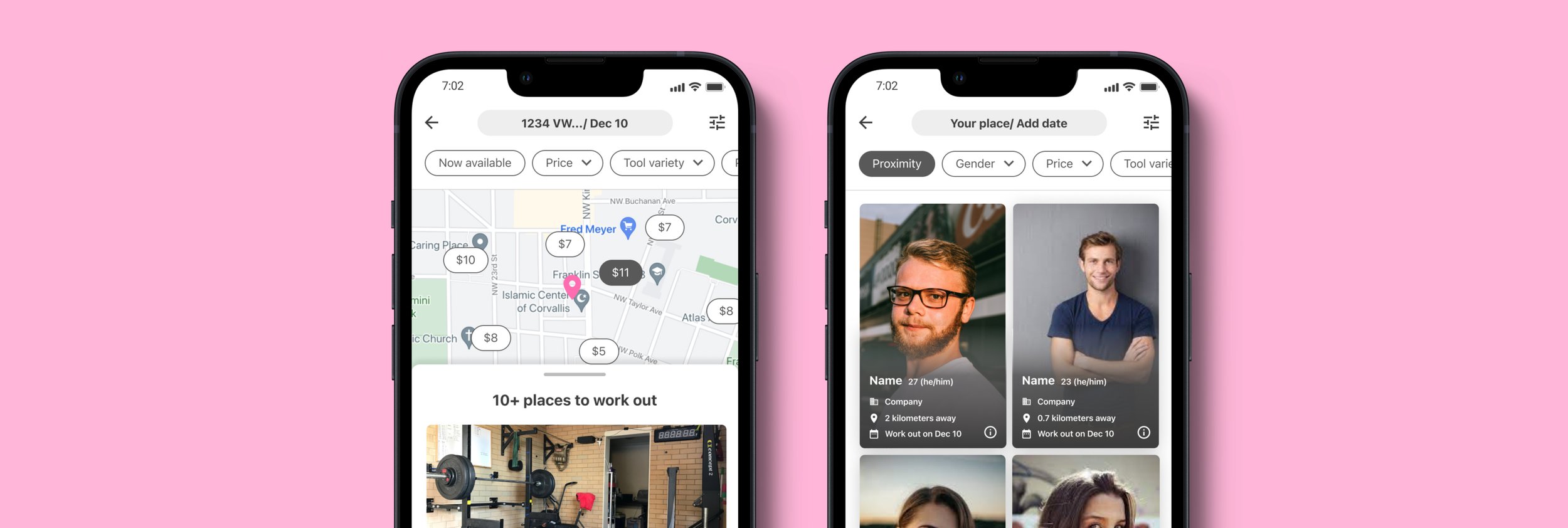
MYGYM operates as a fitness-sharing platform, akin to an "Airbnb for gyms." Travelers, the primary users, can search for available workout spaces and equipment in their travel destination. Local individuals list their home gyms for rent, offering travelers convenient access to fitness facilities in areas with limited gym options. Additionally, MYGYM facilitates connections with workout buddies, helping users stay motivated and social while staying active during their travels.
Effortless Home Gym Exploration
Quickly find available home gyms with just a glance.
Filter your options based on your equipment preferences and budget.
Discover payment flexibility options available
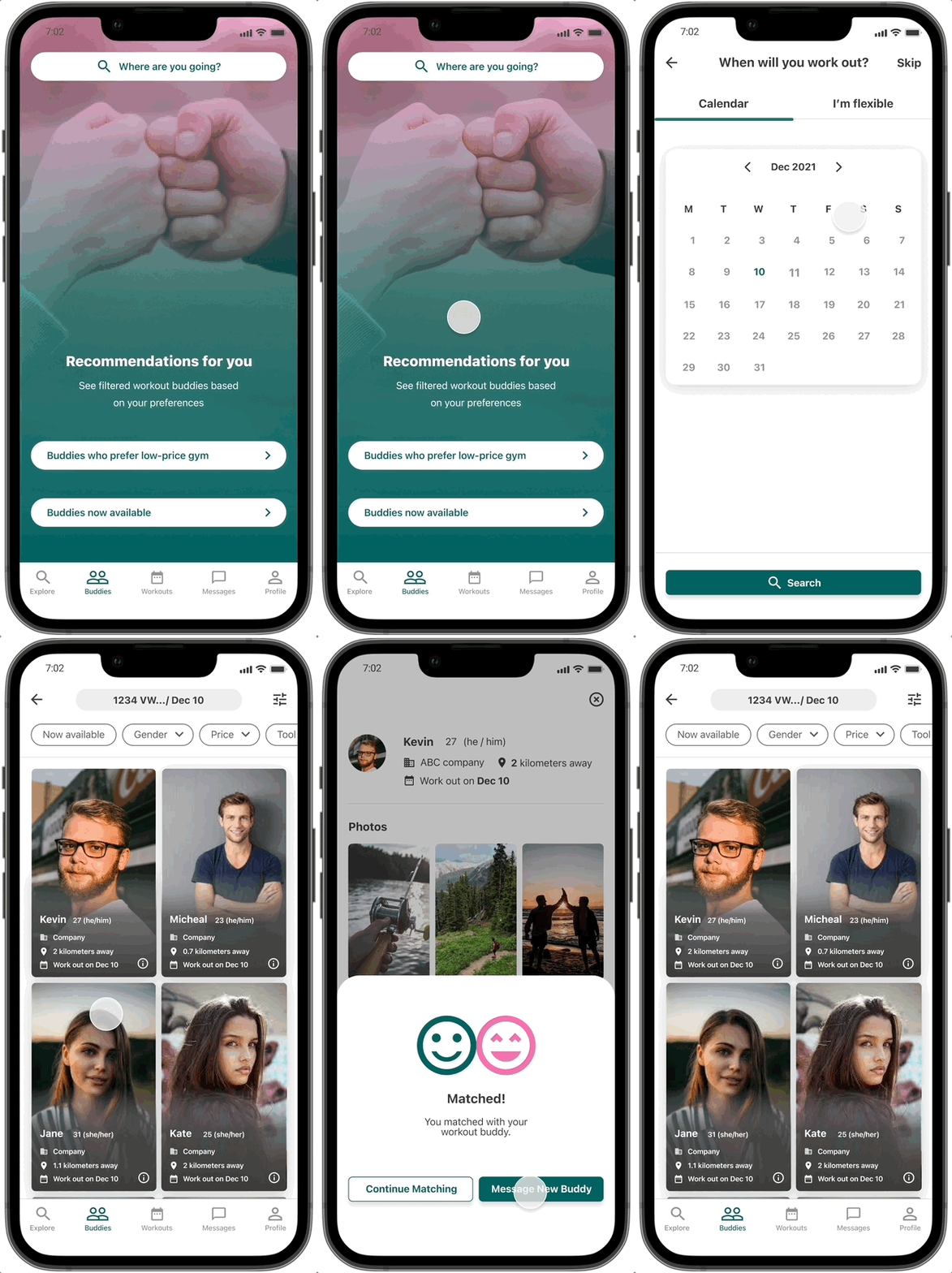
Connect with Workout Partners
Exercising with others helps users stay motivated
Easily coordinate schedules that work for both parties
Get to know potential workout buddies through their profiles before meeting up
Home Gym Rental
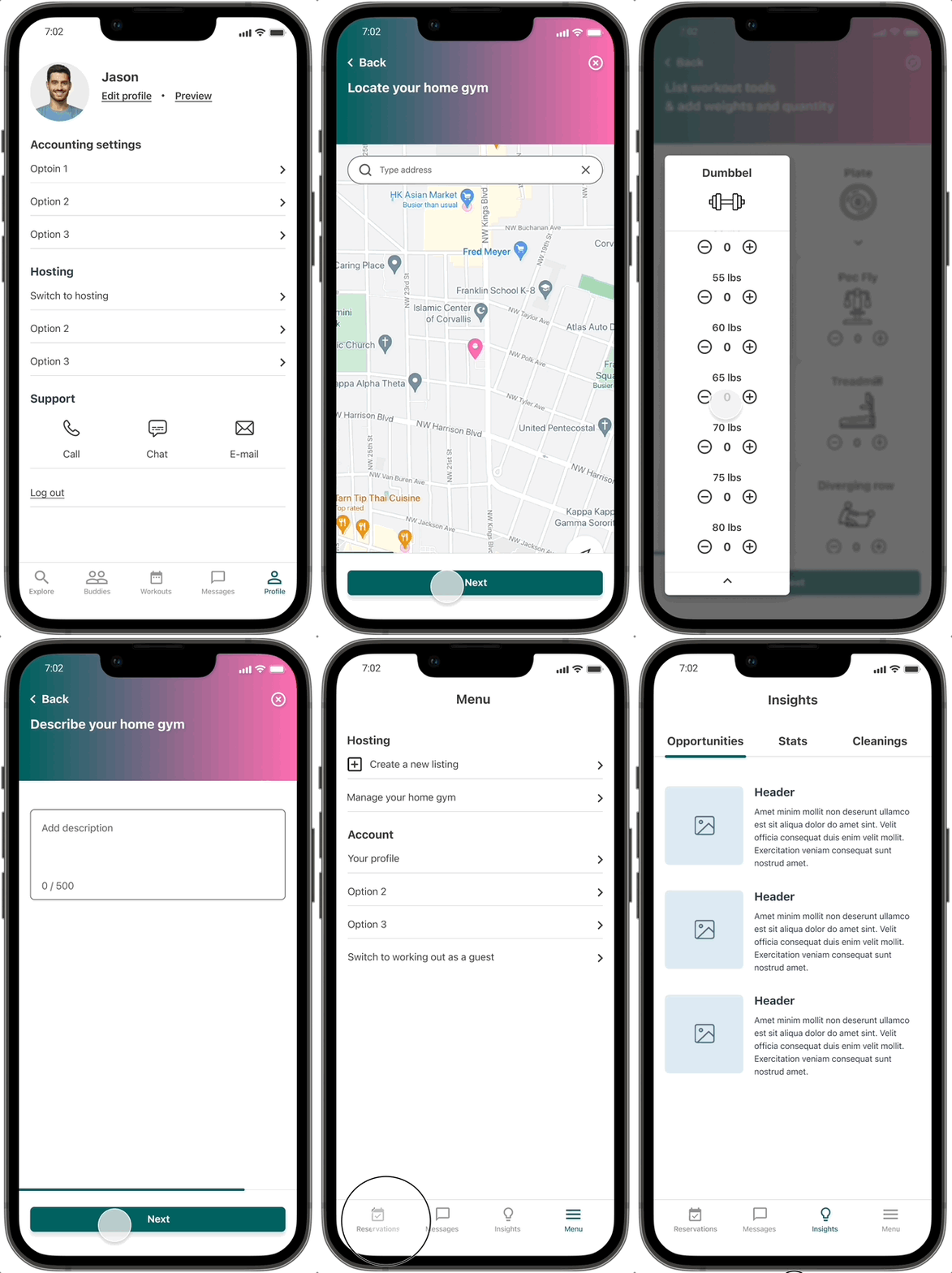
Create listings for your home gym
Handle reservations efficiently
Provide learning resources to enhance the home gym experience for users
Design Thinking Process
Empathize
In my UX research focused on addressing gym inaccessibility for travelers, I started with thorough secondary research to understand the problem. I then conducted one-on-one interviews with travelers to gather firsthand insights.
With this qualitative data, I organized and grouped user feedback using affinity diagramming, identifying patterns and key themes. This formed the basis for developing strategies and design solutions to improve gym accessibility for travelers at their destinations.
Secondary Research
Hypothesis & Assumptions
There may be limited gym options at travel destinations.
Travelers may prefer not to obtain short-term gym memberships.
Existing gyms may lack adequate gymnastics equipment.
Research Method
I opted for secondary research to clarify the problem scope and to validate my assumptions by collecting extensive data.
Insights
It's clear that fitness enthusiasts face challenges in maintaining their workout routines while traveling. The data indicates that the main contributing factors to this issue include a shortage of gyms, membership limitations, and subpar gym facilities.
Primary Research: User Interviews
Research Method
I conducted user interviews to gain insights into the experiences of our target users within the problem space. This information will aid in defining our user base and creating personas in the next stage of the process.
Interviews: One-on-one interviews with structured questions
Affinity Mapping: Organizing and visualizing data
Sample Questions
How does your exercise routine differ when you're traveling compared to your routine at home?
What challenges or obstacles do you encounter when trying to find a gym while traveling?
Have you faced any difficulties when working out outside of a gym, such as exercising on your own or using hotel facilities?
Could you share any strategies or methods you currently use to address the issue of not having access to a gym while traveling?
Insights
Using the affinity diagram, I uncovered the following insights by grouping related information regarding gym accessibility issues during travel.
Empathy Maps
Research Method
An empathy map assists me in visually organizing the insights, observations, and quotes gathered from user interviews. This aids in comprehending my users' pain points, goals, feelings, thoughts, and behaviors. Additionally, it serves as an alternative method for creating user personas.
Insights
Users may not always follow through with what they claim to do. For instance, even though they initially state a lack of knowledge about gym locations at their travel destination, they often manage to find places to work out.
By delving into the user's thought process, I gain insight into their pain points and what they aspire to achieve in their workout experience while traveling.
Personas
I developed personas by synthesizing insights gathered from my primary and secondary research, as well as the empathy map. These personas serve as a constant reminder of the specific user group I'm designing for, helping me to make informed design decisions and view pain points and goals from their perspective.
My target users typically fall within the age range of 18-54.
They have a strong desire to maintain their health and fitness.
These individuals are often medium- to long-term travelers.
My target users are committed to working out multiple times a week.
Define
Jobs To Be Done Framework (JTBD)
The Jobs To Be Done (JTBD) framework is a valuable tool for understanding the tasks and goals that users aim to achieve within the fitness context. It guides us in identifying essential features to enhance users' workout experiences.
Here are some insights derived from this framework:
Users seek affordability and convenience when choosing a gym.
Users desire access to a diverse range of gym equipment for a well-rounded workout experience.
Users prioritize quick and efficient access to gyms, minimizing the time spent getting there.
Users are motivated by incentives to exercise in unfamiliar or travel destinations, making it a more appealing prospect.
How Might We (HMW)
The HMW framework has been instrumental in shaping my problem statement and generating innovative solutions. Crafting effective HMW questions is crucial because they open up the possibility for a wide range of creative answers.
Here are some key insights I gained from using the HMW framework:
The HMW questions have been instrumental in sparking numerous ideas, with some eventually evolving into the final project concept.
Drawing inspiration from disruptive business models like Uber and Airbnb, I realized the potential of a sharing system in addressing the accessibility challenge for services.
Recognizing the need for motivation among users to work out at their travel destinations, I also discovered that having a workout partner can be a significant motivator. This insight led to the idea of incorporating a matching function within the project.
Ideate
User stories
Crafting user stories is a valuable practice that assists me in determining the most important features for the Minimum Viable Product (MVP). This approach enables me to concentrate on developing a product that includes only the vital functionalities necessary for users to successfully accomplish their primary tasks.
Site map
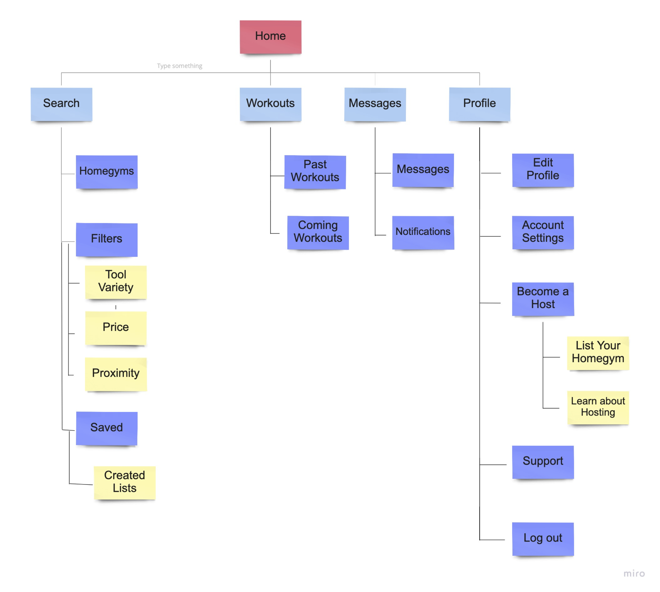
Sitemaps serve as a helpful tool for me to effectively manage the various screens within an app and visualize their interconnectedness. In this context, I opted for a bottom navigation bar featuring "Search," "Workouts," "Messages," and "Profile," which enhances the overall user experience by streamlining navigation and making it more efficient.
User flows
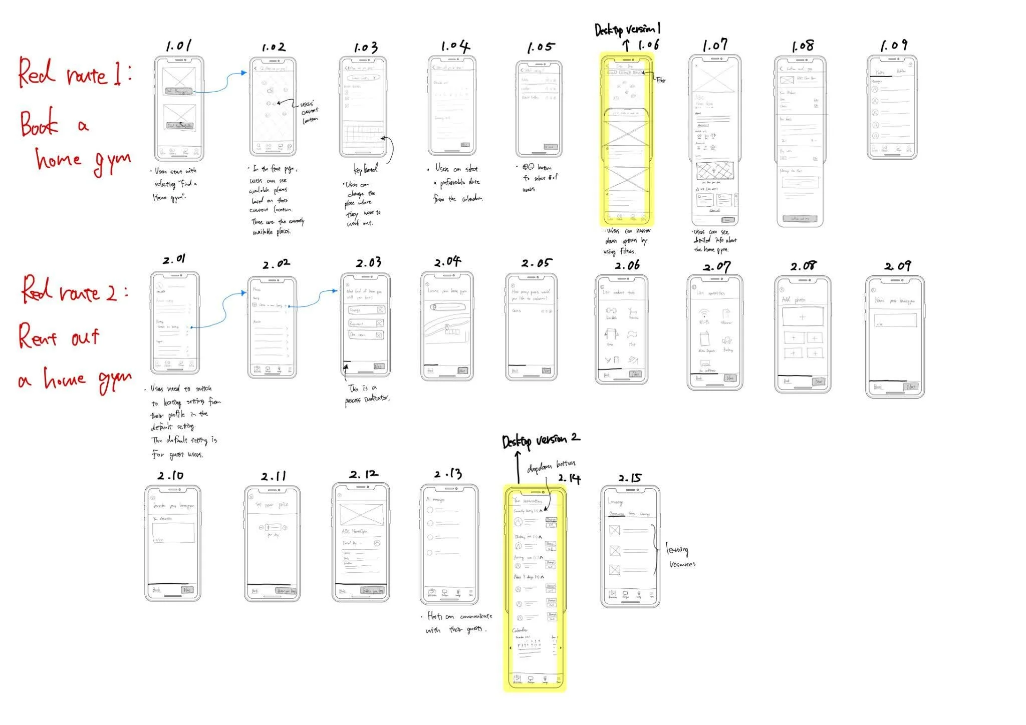
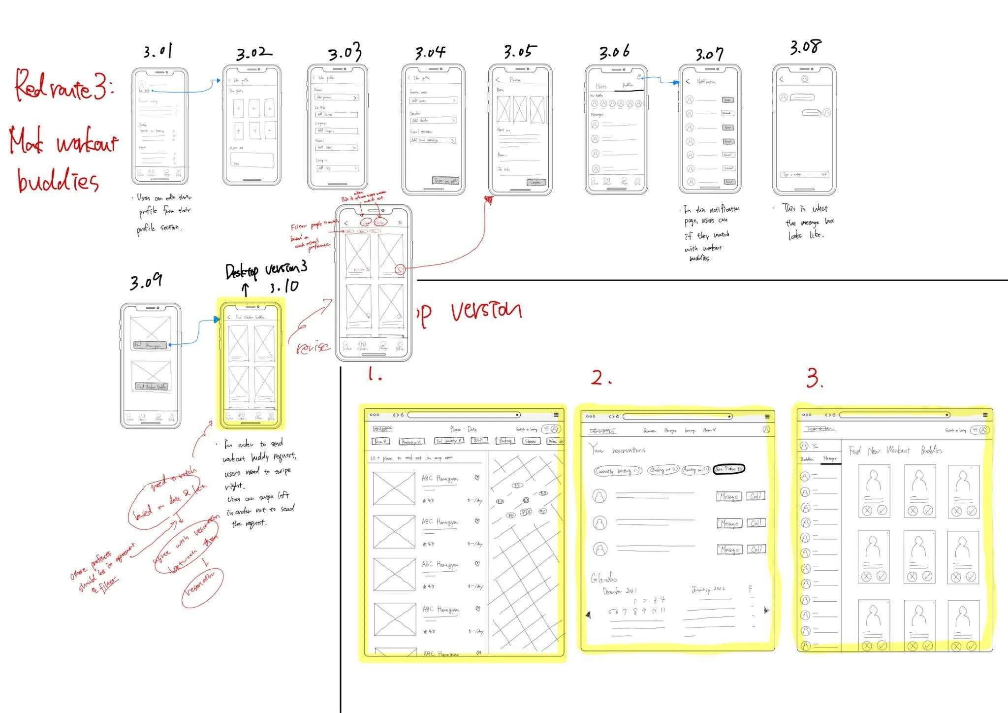
User flows are a valuable tool for mapping out the specific paths that users follow within my app to accomplish their objectives. These flows are structured around the three primary and frequently used routes, referred to as "red routes," which align with the tasks and actions of my personas. This approach serves as a guiding framework during the prototype phase, ensuring that I stay focused on delivering a user-friendly and efficient product experience.
Heuristic Analysis of Competitors
The research method I employed was Heuristic Analysis, which proved to be instrumental in assessing the design quality of both my competitors and other companies offering similar products. I conducted a thorough analysis of three key competitors, namely "Airbnb," "ParkStash," and "Spotr," focusing on three core heuristic principles: "Visibility of system status," "Consistency and standards," and "Aesthetic and minimalist design."
Through this analysis, I gained valuable insights into the strengths and weaknesses of my competitors' designs. This, in turn, provided me with inspiration and ideas to identify opportunities for enhancing the user interface (UI) designs in my own product.
Sketch & Usability Test #1
Following the user flow development, I began sketching out the three critical user paths in my app. Using the POP Marvel app, I transformed these sketches into a functional prototype for users to interact with.
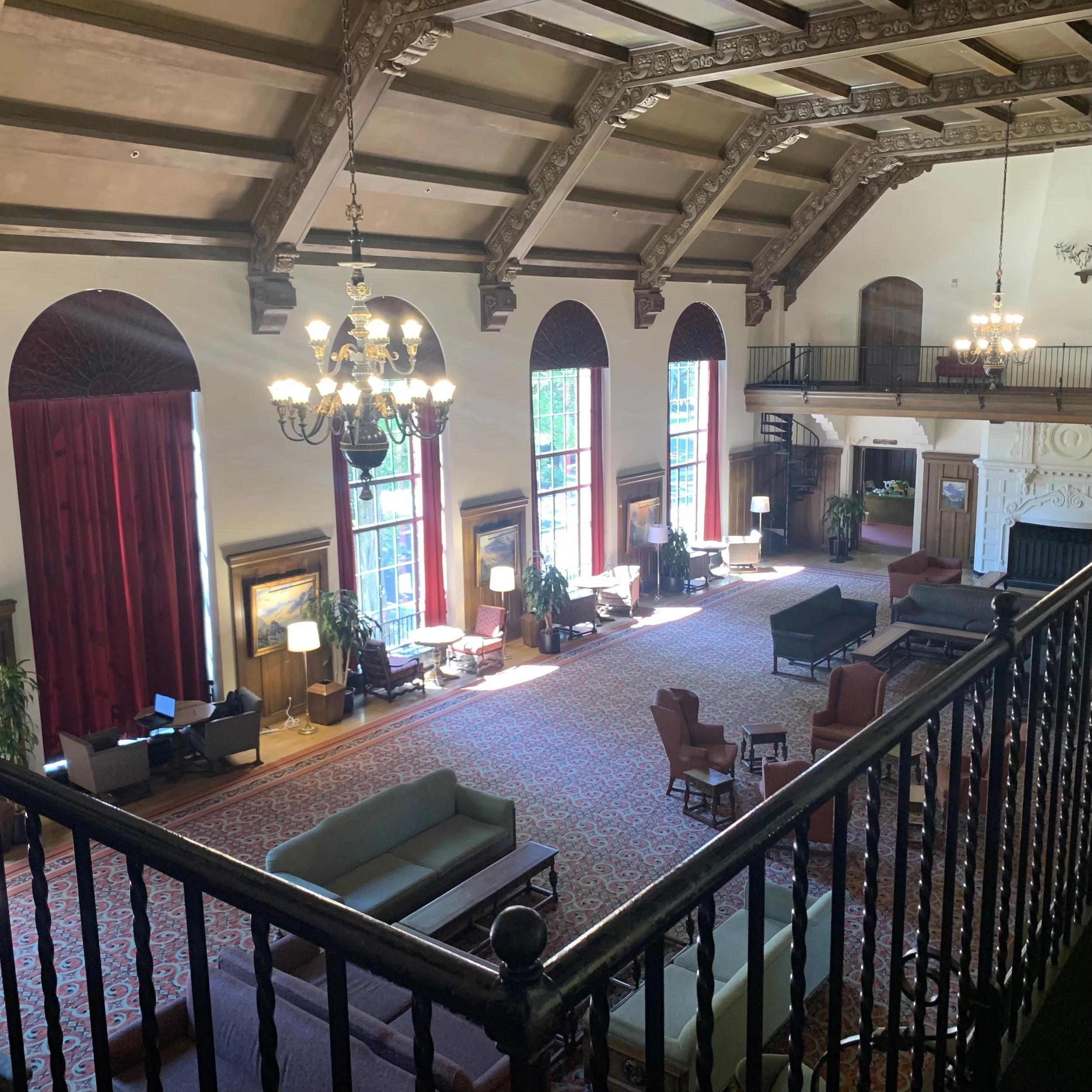
For the initial usability test, I conducted interviews with 5 participants in the Oregon State University cafeteria, incentivizing them with a $4 cookie.
Insights from the test revealed two key issues:
Participants encountered difficulty proceeding to book a home gym immediately after selecting the "Find Home Gyms" button on the home screen within the "Explore" tab.
Solution: To address this, I proposed creating a dedicated home screen for the booking process. This screen would provide clear descriptions for buttons, aiding users in accomplishing their tasks.
Users found it confusing that there were two primary user flows, "Find Home Gyms" and "Find Workout Buddies," combined on a single screen. They expected distinct tabs for each flow.
Solution: To resolve this, I suggested implementing individual tabs within the bottom navigation bar for each of the two primary user flows. This would make it easy for users to select the flow they needed to complete their tasks.
Medium Fidelity Wireframes
Following the initial usability test conducted on the low-fidelity mockups, I proceeded to create medium-fidelity wireframes. These wireframes served as a foundational template for the development of the high-fidelity prototype.
Style guide
A style guide establishes a set of consistent design rules and standards that maintain uniformity and represent the desired brand appearance across various forms of visual media. This guide can be easily updated whenever changes are necessary and serves as the cornerstone for building a cohesive visual foundation for the high-fidelity prototype.
Prototype
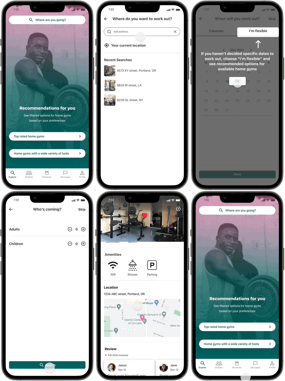
After completing the wireframes and referring to the style guide, I embarked on the development of a High-Fidelity Prototype. This phase allowed me to transform abstract design concepts into a tangible and interactive representation.
Animation & Transitions
Animation and transitions play a significant role in enhancing user interactions, boosting engagement, and reinforcing the brand's personality and attributes. To ensure a smooth and consistent user experience, I implemented entrance and exit animations with a duration of 300ms across all pages with animation. I leveraged Figma's prototyping functions to seamlessly integrate these transitions into the user interface.
Test
Usability Test #2
I conducted 5 interviews using 11 questions at the memorial union at the Oregon State University. On average, participants were able to successfully complete 80% of the tasks. However, for the remaining tasks, participants struggled to understand how to proceed to the next steps or determine their progress within the process. The primary issue they encountered was related to the functionality of buttons on the home screen of the "Explore" tab.
Iterations & improvements
I conducted 5 interviews using 11 questions. On average, participants were able to successfully complete 80% of the tasks. However, for the remaining tasks, participants struggled to understand how to proceed to the next steps or determine their progress within the process. The primary issue they encountered was related to the functionality of buttons on the home screen of the "Explore" tab.
Iteration #1
Buttons on the “Explore” tab
Some users found it confusing to understand the purpose of each button and were unsure about the next steps. To address this, I made two key design decisions. Firstly, I relocated the primary button to the top and revised its label to 'Where are you going?' to make it more prominent and user-friendly. Secondly, I added descriptive information to the two buttons at the bottom, providing users with clear indications that these buttons offer recommended options.
Iteration #2
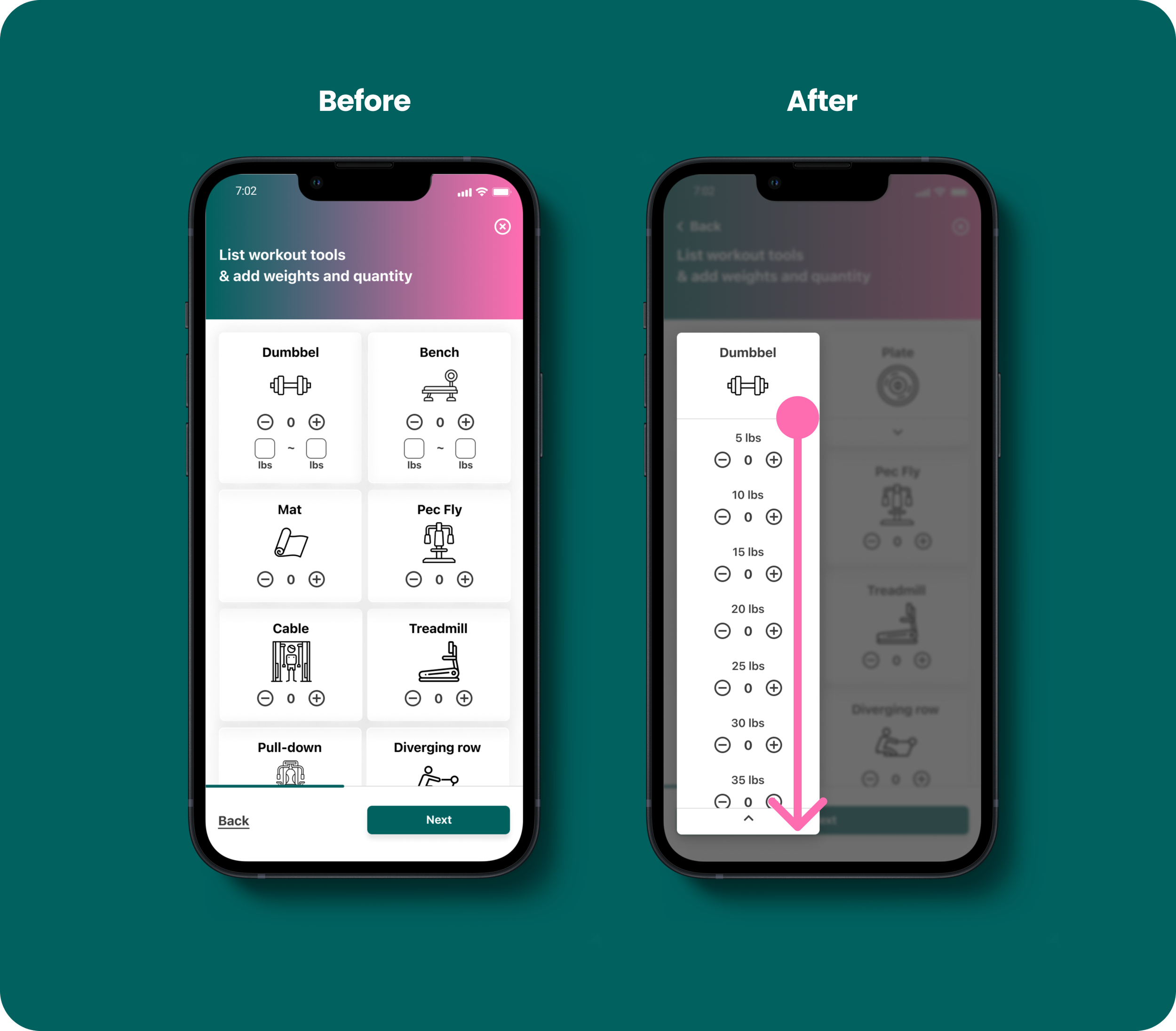
Cards for dumbbells and plates
Users were initially uncertain about how to input the number and weights of dumbbells and plates on the original screen. To address this issue, I implemented an animation that expands the cards, allowing users to view comprehensive lists of weights and corresponding selection buttons for each item.
Iteration #3
Onboarding for rescheduling function
Another usability issue we encountered was that some participants failed to notice the functionality associated with the rescheduling button. To address this, I introduced a one-time onboarding coach mark to guide users on how to utilize this feature effectively.
Usability Testing #3
In the final round of usability testing, I brought my revised prototype to the Memorial Union on campus. There, I conducted interviews with 5 additional participants to evaluate the effectiveness of the UI iterations I had made.
Insights
On average, 91% of the tasks were successfully completed by the participants without requiring any assistance, marking an improvement of 11% compared to the previous tests. The introduction of the onboarding coach mark proved to be instrumental in aiding users with rescheduling their plans to book a home gym.
Conclusion
Future Plans
To enhance the app further, I would introduce additional animations and functionality wherever they prove beneficial. For instance, implementing filter functions would empower users to customize their search for home gyms or workout buddies based on their preferences. Additionally, conducting another usability test after these iterations would help ensure that the enhancements align well with user needs and expectations.
Learnings
Through the MYGYM project, I've embraced the principles of the design thinking process and gained a profound understanding of the significance of iterations in design projects. These iterative steps are crucial for proactively identifying and addressing potential flaws and usability issues before product launch. This experience has empowered me to adopt a user-centric mindset, enabling me to make informed decisions that prioritize and enhance the overall user experience.


